
This Android tutorial explains,
- How to get holo theme for Spinner in Android 2.x
- How to change the Spinner background style
- How to change the background color of selected spinner list item
Download “Android Spinner Style Example” SpinnerStyleDemo.zip – Downloaded 5526 times – 1 MB
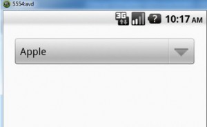
In Android 2.x , Spinner style looks like the one shown below. The default theme for versions less than 11 is @android:style/Theme .
In Android 4.x, Spinner style looks like the one shown below.

If an app does not explicitly request a theme in its manifest, Android System will determine the default theme based on the app’s targetSdkVersion to maintain the app’s original expectations:
| Android SDK Version | Default Theme |
|---|---|
| Version < 11 | @android:style/Theme |
| Version between 11 and 13 | @android:style/Theme.Holo |
| 14 and higher | @android:style/Theme.DeviceDefault |
Android’s resource system selects the themes for your app automatically based on the platform version of the device it’s running on. For example,
- If the device version is < 11 , it applies the theme defined in res/values folder.
- If the device version is between 11 and 13 , it applies the theme defined in res/values-v11 folder.
- If the device version is 14 or higher , it applies the theme defined in res/values-v14 folder.
Android Project
Create an Android project and name it as SpinnerStyleDemo .
res/values folder
strings.xml
Open res/values/strings.xml and replace it with following content.
|
1
2
3
4
5
6
7
8
9
10
11
12
13
14
15
16
17
|
<?
xml
version
=
"1.0"
encoding
=
"utf-8"
?>
<
resources
>
<
string
name
=
"app_name"
>
SpinnerStyleDemo
<
/
string
>
<
string
name
=
"action_settings"
>
Settings
<
/
string
>
<
string
name
=
"hello_world"
>
Hello
world
!
<
/
string
>
<
string
-
array
name
=
"fruit_array"
>
<
item
>
Apple
<
/
item
>
<
item
>
Banana
<
/
item
>
<
item
>
Orange
<
/
item
>
<
item
>
Mango
<
/
item
>
<
item
>
Pineapple
<
/
item
>
<
item
>
Strawberry
<
/
item
>
<
item
>
Cranberry
<
/
item
>
<
/
string
-
array
>
<
/
resources
>
|
colors.xml
Create a new file colors.xml in res/values/ to define colors and replace it with following content.
|
1
2
3
4
|
<?
xml
version
=
"1.0"
encoding
=
"utf-8"
?>
<
resources
>
<
color
name
=
"transparent"
>
#00000000</color>
<
/
resources
>
|
styles.xml
Open res/values/styles.xml and replace it with following content.
|
1
2
3
4
5
6
7
8
9
10
11
12
13
14
15
16
17
18
19
20
21
22
23
24
25
26
27
28
29
30
|
<
resources
>
<style
name
="SpinnerTheme"
parent
="android
:
Widget.Spinner">
<item
name
="android
:
background">@drawable/spinner_background_holo_light</item>
<item
name
="android
:
dropDownSelector">@drawable/list_selector_holo_light</item>
</style>
<style
name
="SpinnerTheme.DropDown">
<item
name
="android
:
spinnerMode">dropdown</item>
</style>
<
!
--
Changes
the
spinner
drop
down
item
radio
button
style
--
>
<style
name
="DropDownItemSpinnerTheme"
parent
="android
:
Widget.DropDownItem.Spinner">
<item
name
="android
:
checkMark">@drawable/btn_radio_holo_light</item>
</style>
<style
name
="ListViewSpinnerTheme"
parent
="android
:
Widget.ListView">
<item
name
="android
:
listSelector">@drawable/list_selector_holo_light</item>
</style>
<style
name
="ListViewSpinnerTheme.White"
parent
="android
:
Widget.ListView.White">
<item
name
="android
:
listSelector">@drawable/list_selector_holo_light</item>
</style>
<style
name
="SpinnerItemTheme"
parent
="android
:
TextAppearance.Widget.TextView.SpinnerItem">
<item
name
="android
:
textColor">#000000</item>
</style>
<
/
resources
>
|
themes.xml
Create a new file themes.xml in res/values and replace it with following content. This Android themes.xml defines Holo theme for Spinner widget for devices running on Android 2.x.
|
1
2
3
4
5
6
7
8
9
10
11
12
13
14
|
<?
xml
version
=
"1.0"
encoding
=
"utf-8"
?>
<
resources
xmlns
:
android
=
"http://schemas.android.com/apk/res/android"
>
<style
name
="AppTheme"
parent
="android
:
Theme.Light">
<item
name
="android
:
spinnerStyle">@style/SpinnerTheme</item>
<item
name
="android
:
dropDownSpinnerStyle">@style/SpinnerTheme.DropDown</item>
<item
name
="android
:
spinnerDropDownItemStyle">@style/DropDownItemSpinnerTheme</item>
<item
name
="android
:
listViewStyle">@style/ListViewSpinnerTheme</item>
<item
name
="android
:
listViewWhiteStyle">@style/ListViewSpinnerTheme.White</item>
<item
name
="android
:
spinnerItemStyle">@style/SpinnerItemTheme</item>
</style>
<
/
resources
>
|
res/values-v11 folder
styles.xml
Create a new res/values-v11/styles.xml and replace it with following content.
|
1
2
3
4
5
6
7
8
|
<
resources
>
<style
name
="SpinnerTheme"
parent
="android
:
Widget.Holo.Light.Spinner">
<item
name
="android
:
background">@drawable/spinner_background_holo_light</item>
<item
name
="android
:
dropDownSelector">@drawable/list_selector_holo_light</item>
</style>
<
/
resources
>
|
themes.xml
Create a new res/values-v11/themes.xml and replace it with following content. This Android themes.xml defines theme for Spinner widget for devices running on versions between 11 and 13. Here, we define custom style for Spinner, i.e.)
- to change the default spinner background color
- to change the spinner list item highlighted color
|
1
2
3
4
5
6
7
8
9
10
11
12
13
|
<?
xml
version
=
"1.0"
encoding
=
"utf-8"
?>
<
resources
xmlns
:
android
=
"http://schemas.android.com/apk/res/android"
>
<style
name
="AppTheme"
parent
="android
:
Theme.Holo.Light">
<item
name
="android
:
dropDownSpinnerStyle">@style/SpinnerTheme</item>
<item
name
="android
:
listChoiceBackgroundIndicator">@drawable/list_selector_holo_light</item>
<!--
Drawable
used
as
a
background
for
activated
items.
-->
<item
name
="android
:
activatedBackgroundIndicator">
@drawable/activated_background_holo_light</item>
</style>
<
/
resources
>
|
res/values-v14 folder
styles.xml
Create a new res/values-v14/styles.xml and replace it with following content.
|
1
2
3
4
5
6
7
8
9
10
11
12
|
<
resources
>
<style
name
="SpinnerAppTheme"
parent
="android
:
Widget.Holo.Light.Spinner">
<item
name
="android
:
background">@drawable/spinner_background_holo_light</item>
<item
name
="android
:
dropDownSelector">@drawable/list_selector_holo_light</item>
</style>
<style
name
="ListViewAppTheme"
parent
="android
:
Widget.Holo.Light.ListView">
<item
name
="android
:
listSelector">@drawable/list_selector_holo_light</item>
</style>
<
/
resources
>
|
themes.xml
Create a new res/values-v14/themes.xml and replace it with following content. This Android themes.xml defines theme for Spinner widget for devices running on versions 14 or higher. Here, we define custom style for Spinner, i.e.)
- to change the default spinner background color
- to change the spinner list item highlighted color
|
1
2
3
4
5
6
7
8
9
10
11
|
<
resources
>
<style
name
="AppTheme"
parent
="android
:
Theme.Holo.Light.DarkActionBar">
<!--
API
14
theme
customizations
can
go
here.
-->
<item
name
="android
:
spinnerStyle">@style/SpinnerAppTheme</item>
<item
name
="android
:
dropDownListViewStyle">@style/ListViewAppTheme</item>
<item
name
="android
:
listViewStyle">@style/ListViewAppTheme</item>
</style>
<
/
resources
>
|
res/drawable folder
All these drawable XML files refers to drawables in hdpi, mdpi, xhdip folders.
activated_background_holo_light.xml
This drawable file is used by themes.xml defined in values-v11. It defines drawable used as a background for activated items.
|
1
2
3
4
5
6
|
<?
xml
version
=
"1.0"
encoding
=
"utf-8"
?>
<
selector
xmlns
:
android
=
"http://schemas.android.com/apk/res/android"
>
<
item
android
:
state_activated
=
"true"
android
:
drawable
=
"@drawable/list_activated_holo"
/
>
<
item
android
:
drawable
=
"@android:color/transparent"
/
>
<
/
selector
>
|
btn_radio_holo_light.xml
This drawable file changes the spinner drop down item radio button style.
|
1
2
3
4
5
6
7
8
9
10
11
12
13
14
15
16
17
18
19
20
21
22
23
24
25
26
27
28
29
30
31
32
33
34
35
36
37
38
39
40
41
42
43
44
45
46
|
<?
xml
version
=
"1.0"
encoding
=
"utf-8"
?>
<
selector
xmlns
:
android
=
"http://schemas.android.com/apk/res/android"
>
<
item
android
:
state_checked
=
"true"
android
:
state_window_focused
=
"false"
android
:
state_enabled
=
"true"
android
:
drawable
=
"@drawable/btn_radio_on_holo_light"
/
>
<
item
android
:
state_checked
=
"false"
android
:
state_window_focused
=
"false"
android
:
state_enabled
=
"true"
android
:
drawable
=
"@drawable/btn_radio_off_holo_light"
/
>
<
item
android
:
state_checked
=
"true"
android
:
state_pressed
=
"true"
android
:
state_enabled
=
"true"
android
:
drawable
=
"@drawable/btn_radio_on_pressed_holo_light"
/
>
<
item
android
:
state_checked
=
"false"
android
:
state_pressed
=
"true"
android
:
state_enabled
=
"true"
android
:
drawable
=
"@drawable/btn_radio_off_pressed_holo_light"
/
>
<
item
android
:
state_checked
=
"true"
android
:
state_focused
=
"true"
android
:
state_enabled
=
"true"
android
:
drawable
=
"@drawable/btn_radio_on_focused_holo_light"
/
>
<
item
android
:
state_checked
=
"false"
android
:
state_focused
=
"true"
android
:
state_enabled
=
"true"
android
:
drawable
=
"@drawable/btn_radio_off_focused_holo_light"
/
>
<
item
android
:
state_checked
=
"false"
android
:
state_enabled
=
"true"
android
:
drawable
=
"@drawable/btn_radio_off_holo_light"
/
>
<
item
android
:
state_checked
=
"true"
android
:
state_enabled
=
"true"
android
:
drawable
=
"@drawable/btn_radio_on_holo_light"
/
>
<
!
--
Disabled
states
--
>
<
item
android
:
state_checked
=
"true"
android
:
state_window_focused
=
"false"
android
:
drawable
=
"@drawable/btn_radio_on_disabled_holo_light"
/
>
<
item
android
:
state_checked
=
"false"
android
:
state_window_focused
=
"false"
android
:
drawable
=
"@drawable/btn_radio_off_disabled_holo_light"
/
>
<
item
android
:
state_checked
=
"true"
android
:
state_focused
=
"true"
android
:
drawable
=
"@drawable/btn_radio_on_disabled_focused_holo_light"
/
>
<
item
android
:
state_checked
=
"false"
android
:
state_focused
=
"true"
android
:
drawable
=
"@drawable/btn_radio_off_disabled_focused_holo_light"
/
>
<
item
android
:
state_checked
=
"false"
android
:
drawable
=
"@drawable/btn_radio_off_disabled_holo_light"
/
>
<
item
android
:
state_checked
=
"true"
android
:
drawable
=
"@drawable/btn_radio_on_disabled_holo_light"
/
>
<
/
selector
>
|
item_background_holo_light.xml
|
1
2
3
4
5
6
7
8
9
10
11
12
13
14
15
16
17
18
19
20
21
|
<?
xml
version
=
"1.0"
encoding
=
"utf-8"
?>
<
selector
xmlns
:
android
=
"http://schemas.android.com/apk/res/android"
>
<
!
--
Even
though
these
two
point
to
the
same
resource
,
have
two
states
so
the
drawable
will
invalidate
itself
when
coming
out
of
pressed
state
.
--
>
<
item
android
:
drawable
=
"@drawable/list_selector_disabled_holo_light"
android
:
state_enabled
=
"false"
android
:
state_focused
=
"true"
android
:
state_pressed
=
"true"
/
>
<
item
android
:
drawable
=
"@drawable/list_selector_disabled_holo_light"
android
:
state_enabled
=
"false"
android
:
state_focused
=
"true"
/
>
<
item
android
:
drawable
=
"@drawable/list_selector_background_transition_holo_light"
android
:
state_focused
=
"true"
android
:
state_pressed
=
"true"
/
>
<
item
android
:
drawable
=
"@drawable/list_selector_background_transition_holo_light"
android
:
state_focused
=
"false"
android
:
state_pressed
=
"true"
/
>
<
item
android
:
drawable
=
"@drawable/list_focused_holo"
android
:
state_focused
=
"true"
/
>
<
item
android
:
drawable
=
"@color/transparent"
/
>
<
/
selector
>
|
list_selector_background_transition_holo_light.xml
|
1
2
3
4
5
|
<?
xml
version
=
"1.0"
encoding
=
"utf-8"
?>
<
transition
xmlns
:
android
=
"http://schemas.android.com/apk/res/android"
>
<
item
android
:
drawable
=
"@drawable/list_pressed_holo_light"
/
>
<
item
android
:
drawable
=
"@drawable/list_longpressed_holo"
/
>
<
/
transition
>
|
list_selector_holo_light.xml
|
1
2
3
4
5
6
7
8
9
10
11
12
13
14
15
16
17
18
19
20
21
22
|
<?
xml
version
=
"1.0"
encoding
=
"utf-8"
?>
<
selector
xmlns
:
android
=
"http://schemas.android.com/apk/res/android"
>
<
item
android
:
drawable
=
"@android:color/transparent"
android
:
state_window_focused
=
"false"
/
>
<
!
--
Even
though
these
two
point
to
the
same
resource
,
have
two
states
so
the
drawable
will
invalidate
itself
when
coming
out
of
pressed
state
.
--
>
<
item
android
:
drawable
=
"@drawable/list_selector_disabled_holo_light"
android
:
state_enabled
=
"false"
android
:
state_focused
=
"true"
android
:
state_pressed
=
"true"
/
>
<
item
android
:
drawable
=
"@drawable/list_selector_disabled_holo_light"
android
:
state_enabled
=
"false"
android
:
state_focused
=
"true"
/
>
<
item
android
:
drawable
=
"@drawable/list_selector_background_transition_holo_light"
android
:
state_focused
=
"true"
android
:
state_pressed
=
"true"
/
>
<
item
android
:
drawable
=
"@drawable/list_selector_background_transition_holo_light"
android
:
state_focused
=
"false"
android
:
state_pressed
=
"true"
/
>
<
item
android
:
drawable
=
"@drawable/list_focused_holo"
android
:
state_focused
=
"true"
/
>
<
/
selector
>
|
spinner_background_holo_light.xml
|
1
2
3
4
5
6
7
8
9
10
|
<?
xml
version
=
"1.0"
encoding
=
"utf-8"
?>
<
selector
xmlns
:
android
=
"http://schemas.android.com/apk/res/android"
>
<
item
android
:
state_enabled
=
"false"
android
:
drawable
=
"@drawable/spinner_disabled_holo_light"
/
>
<
item
android
:
state_pressed
=
"true"
android
:
drawable
=
"@drawable/spinner_pressed_holo_light"
/
>
<
item
android
:
state_pressed
=
"false"
android
:
state_focused
=
"true"
android
:
drawable
=
"@drawable/spinner_focused_holo_light"
/
>
<
item
android
:
drawable
=
"@drawable/spinner_default_holo_light"
/
>
<
/
selector
>
|
XML layout file
This Android Spinner style example uses a layout file to display a Spinner. Open activity_main.xml file in res/layout and replace it with the following content.
|
1
2
3
4
5
6
7
8
9
10
11
12
13
14
15
16
17
18
|
<
RelativeLayout
xmlns
:
android
=
"http://schemas.android.com/apk/res/android"
xmlns
:
tools
=
"http://schemas.android.com/tools"
android
:
layout_width
=
"match_parent"
android
:
layout_height
=
"match_parent"
android
:
paddingBottom
=
"@dimen/activity_vertical_margin"
android
:
paddingLeft
=
"@dimen/activity_horizontal_margin"
android
:
paddingRight
=
"@dimen/activity_horizontal_margin"
android
:
paddingTop
=
"@dimen/activity_vertical_margin"
tools
:
context
=
".MainActivity"
>
<
Spinner
android
:
id
=
"@+id/spinner"
android
:
layout_width
=
"fill_parent"
android
:
layout_height
=
"wrap_content"
android
:
layout_marginBottom
=
"5dp"
android
:
entries
=
"@array/fruit_array"
android
:
scrollbars
=
"none"
/
>
<
/
RelativeLayout
>
|
Output
Place all the nine patch assets, images in drawable (drawable-hdpi, drawable-mdpi and drawable-xhdpi) folder and run the project to get the expected output.
References
- http://android-developers.blogspot.in/2012/01/holo-everywhere.html
- http://developer.android.com/guide/topics/ui/themes.html

-
Leo Santana